A Handbook for Consistent Branding and a Cheap Lunch
Introduction
Welcome
Welcome to the Eidetic Designs brand guidelines.
Using these guidelines consistently helps us distinguish and intensify the worth of our brand in the long haul. It also reduces our legal retainer fees.
We designed these guidelines to assist all involved in the production of our communications and to give our copywriters something to do. Please take time to read and understand them. There might be a quiz later.
We have painstakingly thought about these design standards to guarantee that our visual identity is consistent internationally. Except Hoboken, New Jersey. They have their own style guidelines written by the venerable designer Enzo “The Butcher” Santucci.
This document offers in depth protocols working with the Eidetic Designs visual identity. It includes an overview of our brand positioning, our identity toolbox and a taco platter. Thank you for giving the brand precedence! And tell Enzo we’ll have his money Tuesday.
Introduction
About Eidetic Designs
“Eidetic” means having the ability to recall an image from memory with high precision.
A daringly timid former English teacher turned Goodwill junk sorter started Eidetic Designs in 2021. He set out to prove that the technologically awkward (soft unaware) could master the art of Graphic Design. And get out of jury duty.
He enrolled in Emory University’s Continuing Education Program and proceeded to excel at what psychiatrists call “delusions of polymorphic nature” or “not thinking straight.”
Eidetic Designs will merge creative thinking and technology. When not merging, our staff will attempt to triumphantly roll a Slinky down the stairs.
Visual Identity
Overview
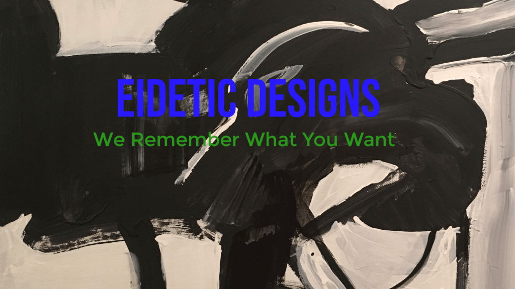
The first way we establish the Eidetic presence is with our logomark. Our insignia is the purest way we can visually identify our brand. We can also call during dinner.
The signature Eidetic Elephant consists of a painting by the renowned Avant garde artist MVT. While the painting resembles an elephant, her reference point was a squeegee. As such, reproducing the logomark with computer software would consume valuable time. If you would like permission to use the logomark, contact our lawyer’s agent’s representative and we’ll work something out.
Logomark
Clearspace
To preserve the integrity of the logomark, no other logos, type, graphics or condiments may invade its space. The minimum clearspace around the logomark is 1/5 of the image’s vertical border and 1/4 of the image’s horizontal border. We consider any violation of the logomark’s space a microaggression and recommend counseling.
Clearspace
Color Palette
Corporate Palette
Color plays a vital role in establishing a brand’s visual identity. Understanding this principle, we use color to influence the way people consider our brand and prevent them from saying the word “diphthong” in mixed company.

Miles Davis Kind of Blue
- R 40 G 25 B 255
- C 84 M 90 Y 0 K 0
- Hex: #2819FF
- Pantone: 2126 C
- Crayola Colored Pencil: Light smudge of Sky Blue with heavy pressing of blue.

Green Day Dookie
- R 16 G 116 B 12
- C 86 M 0 Y 90 K K 55
- Hex: #10740C
- Pantone: 2259 C
- Crayola Colored Pencil: Light marks of Yellow with intense force of the Yellow Green with a grazing of Green.

Public Enemy Fear of a Black Planet
- R 0 G 0 B 0
- C 0 M 0 Y 0 B 100
- Hex: #000000
- Pantone: Black 6 C
- Crayola Colored Pencil: Scrub mercilessly with the Black pencil.
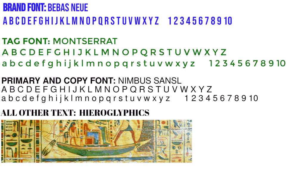
Typography
Primary Typography
Our corporate typography serves two purposes. First, to create a unique and consistent look across all of our communications. Second, blank pages communicate absolutely zilch. Hans Helmholtz’s classic memoir, “Can’t Read Between the Lines,” proved this theory correct. While great poolside reading, the three hundred empty pages said nothing of Hemholtz’s life. However, the movie rights sold for seven figures.
Visual Identity
Unacceptable Uses of the Eidetic Elephant
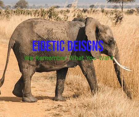
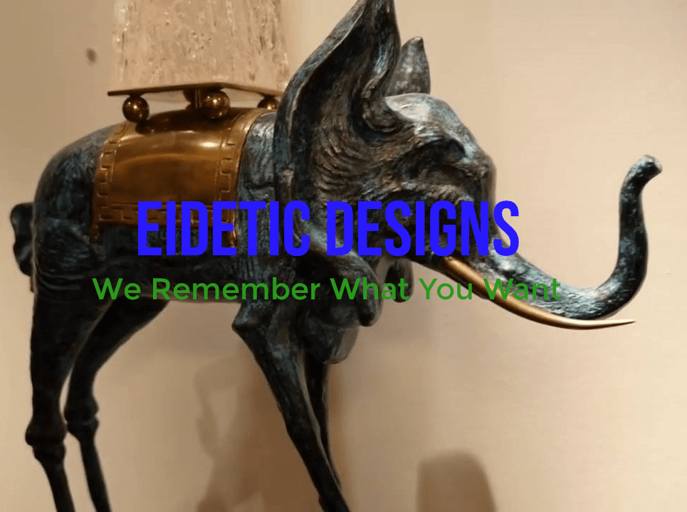
A real elephant. No. 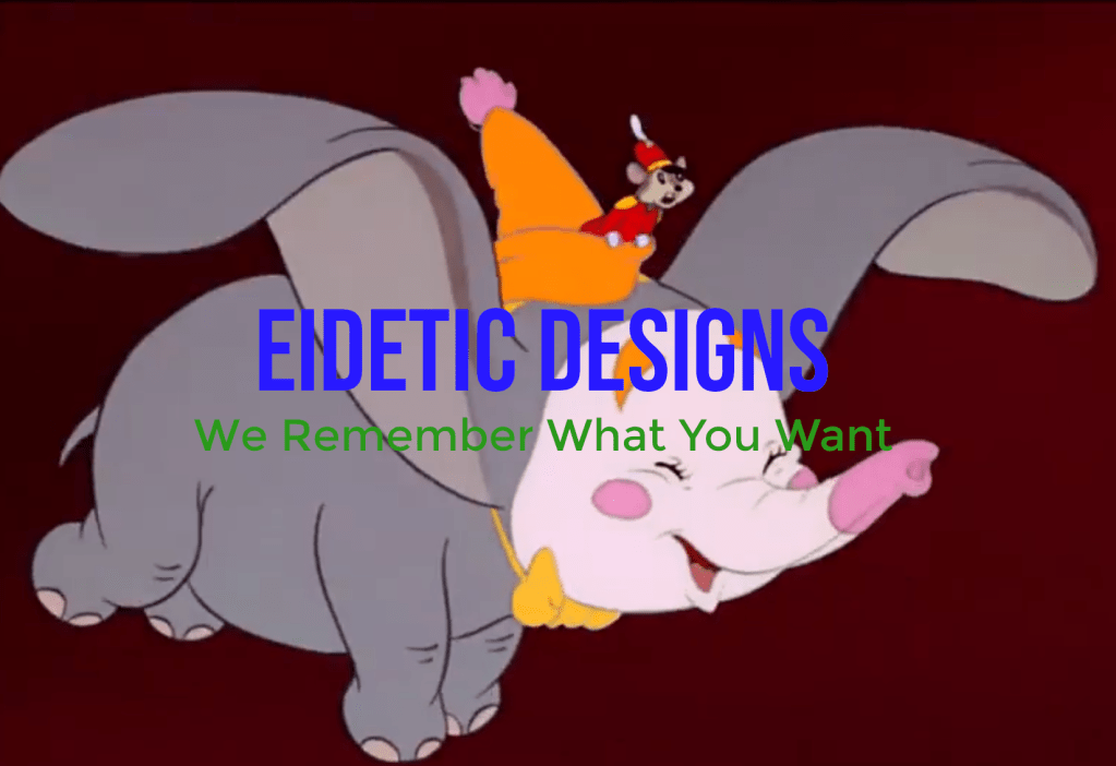
A cartoon elephant. Out of the question.
Conclusion
Closing